The very first impression could be made only once.
Mobile application development implies the design of App Store screenshots as a way to present the platform to the audience. Those images are intended to convince potential clients that a particular online system can solve users’ problems and bring them certain values and benefits. Thus, creating amazing pictures is a critical point to take care of.
Our task today is to offer you some helpful tips on how to make effective screenshots, so let’s start.
Contents
What app screenshots shall include?
There’s no doubt that screenshots should conform to the requirements App Store & Google Play allow. Nevertheless, it’s hardly enough to attract the audience and motivate people to download the resource you offer. The process of building screenshots has to be approached wisely.
In fact, you could consider a gallery of screenshots as an opportunity to tell your story, present the features of your service, and begin a heart-to-heart communication with your customers. Here are our recommendations.
# Well-presented key message
Obviously, it’s important to make the right choice regarding the style of your screenshots. However, you need to have a clear understanding of what message you’d like to convey to individuals. For instance, you could describe what your software is capable of. A great approach would be to introduce its characteristics as benefits.
Show what issues users will resolve by means of your program. Explain what your solution does, describe how your platform differs from competitors, and illustrate that your application is unique.
# Color palette
It’s critical to consider the overall style of your online system. To create a successful app and working screenshots for it, you don’t have to be limited to the UI colors, however, it would be a smart idea to use them to some extend. Just remember about a few points:
- the colors applied shall correspond to the key message of your resource;
- in the best-case scenario, keep the color scheme of screenshots consistent with the colors of the program itself;
- it’s not the right approach to design screenshots like random bright spots.
# The text itself
The concise descriptive text serves to define the key task of the software in question, so right away the audience will know what solution they’re dealing with. A certain call-to-action will perfectly fit in here.
At the same time, one shall be careful not to overdo it, and keep the title to be two lines maximum.
# The localization
Don’t be one of those app owners who undervalue the importance of such a tool, as localization. Being essential at different stages of a service development process, it takes care not only of text translation.
One of the options localization provides is the possibility to adapt screenshots to the specific market taking into account cultural and linguistic aspects. Let’s say, the color scheme could be changed and a picture of a person of a particular nationality could be added.
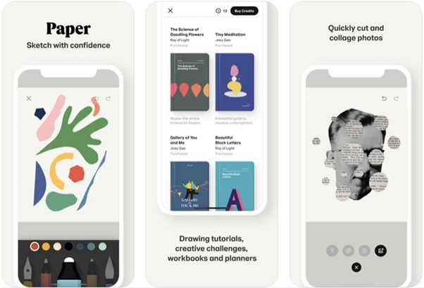
For instance, FiftyThree has decided to adjust the Paper application to make sure it fits the market of Asia since the research has proved that backgrounds having multiple colors are much more preferable among Asian people. Thus, those adjustments helped to increase the conversion rate by over 30%.
# Positive feedback & awards
Don’t be too modest and let customers know about your achievements. Every company has something to be proud of, so show it on your screenshots. Positive reviews, users’ feedback, different awards, and the like, might help in reaching your targeted clients.
A few more points to consider
In order to come up with app screenshots able to grab the attention of users, we’d advise you to take into consideration such aspects, as:
- Future users analysis. The data you gather will suggest what format of the presentation to choose. Program owners shall have a clear understanding of what individuals expect to see and what they actually need.
- Competitive analysis. Make sure you explore existing resources that are similar to yours. It might not be the greatest idea to blindly copy their experience. Your task is to find something special and unique to offer your audience.
- App Store or Google Play. If it’s possible, it’s better to provide both sets of pictures since Android users might have different preferences compared to iOS customers.
- Making a positive first impression. The very first two images have to be the best ones, because only 40% of individuals bother to keep scrolling to see all the screenshots presented. Meaning, the first screenshots must be vivid, appealing, displaying the essence of the software.
- Emphasizing new functionality. After having updated the features of your service, let people know about all the improvements. They should find out about the amazing new possibilities your solution provides.
- A/B tests. In case you can’t decide what screenshots will work better, run A/B tests. Pictures that get greater conversion shall be published on App Store & Google Play.
- Video previews. Why not take advantage of such a great tool as promo videos? They’ll serve to promote your app, as well as its benefits. SplitMetrics claims that placing videos usually increases conversions by 15%.
Instruments to build app store images
There exist multiple frameworks helping to design beautiful images, so we’d like to distinguish the best three solutions.
- Appure. Being pretty easy to apply, the platform generates impressive screenshots. The features contain the absence of watermarks. Moreover, its users can enjoy certain free functions as well.
- Visme. Everyone even persons with poor design experience will enjoy the resource. The paid plan starts with $39/monthly.
- Placeit. The system helps to figure out how the program actually looks in the real life. The software could be applied for free or by subscription.
Summing up
It is quite obvious that visual interaction represents a faster and more efficacious approach compared to textual communication. Consequently, intuitive design and great quality app screenshots will turn to be valuable input for your platform’s success by bringing a larger number of loyal clients.


